Pogrebno Božur
The funeral company Božur has served Belgrade for more than 19 years, available 24 hours a day, every day. We built a discreet, dignified website that clearly explains the service to families in difficult moments and offers a fast, calm path to help, without pressure.
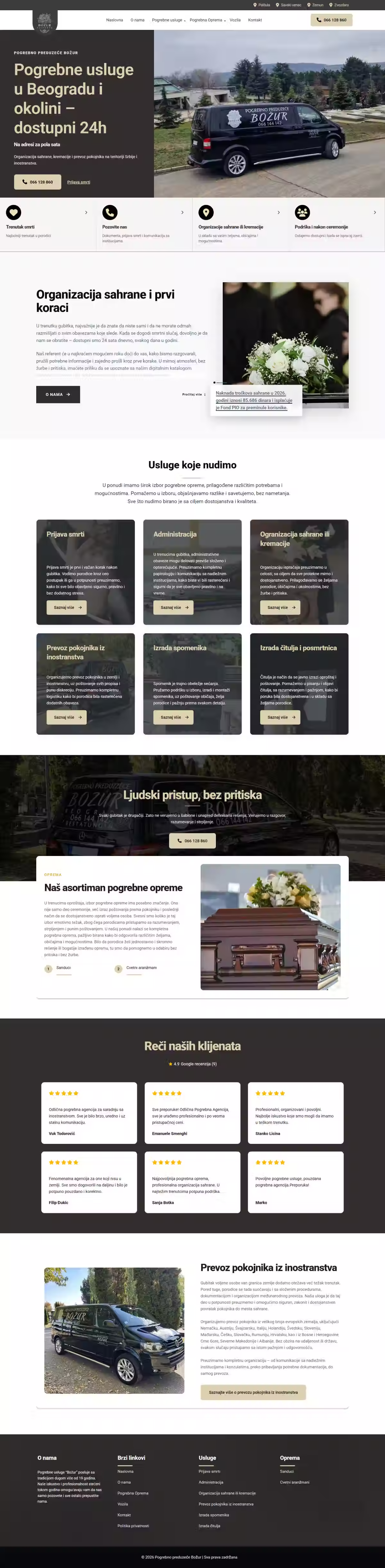
People reach a funeral service in their hardest moment: under stress, in a hurry, often at night. The site must be neither cold nor pushy, yet it has to deliver what matters immediately: what the company does, that it is available 24/7 and how to get in touch fast. The challenge was joining dignity and clarity so a visitor finds help within seconds, without a single unnecessary step.
Not a single decision here is aesthetic. Someone arriving at this site is under stress, often at night, with no patience for one unnecessary step. So the palette is restrained, the text short and free of any sales tone, and the phone number never more than a glance away. Everything else is subordinate to a family getting an answer, and someone on the line, within seconds, with “a human approach, without pressure”.
- Service pages: funerals, cremations, documentation, international transport
- Headstones, obituaries and equipment as separate sections
- 24/7 contact (phone, WhatsApp, Viber) on every page
- LocalBusiness schema and geo data for multiple Belgrade branches
- Live at pogrebnobozurbeograd.rs
How it works.
03 stepsFinds the company at night
The site works at three in the morning exactly as it does at noon, because that is when it is most often needed.
Sees what is involved
What each service covers and what the family needs to prepare, written without legal or sales language.
Gets someone on the line
Phone, WhatsApp and Viber sit on every page, with no form and no waiting for a reply.
A calm, classic, unobtrusive typeface. In this context typography must radiate dignity and quiet, never draw attention to itself. Readability and calm are the only goal.
A deep, warm brown-gray instead of cold black: serious and dignified, yet softer and more comforting in a sensitive moment.
A muted gold brings warmth and a measure of dignity. Like a candle, a soft light on a dark base.
A clean, quiet base that leaves space and calm, with no visual noise.