DIHT Stolarija
DIHT Stolarija is a Belgrade company selling, installing and servicing PVC windows and doors: 14+ years in business, 3,500+ projects and 400+ Google reviews at a 5.0 rating (the company's numbers, not ours). Their site undermined that reputation; we did a complete redesign, with the UX designed around the path to an inquiry.
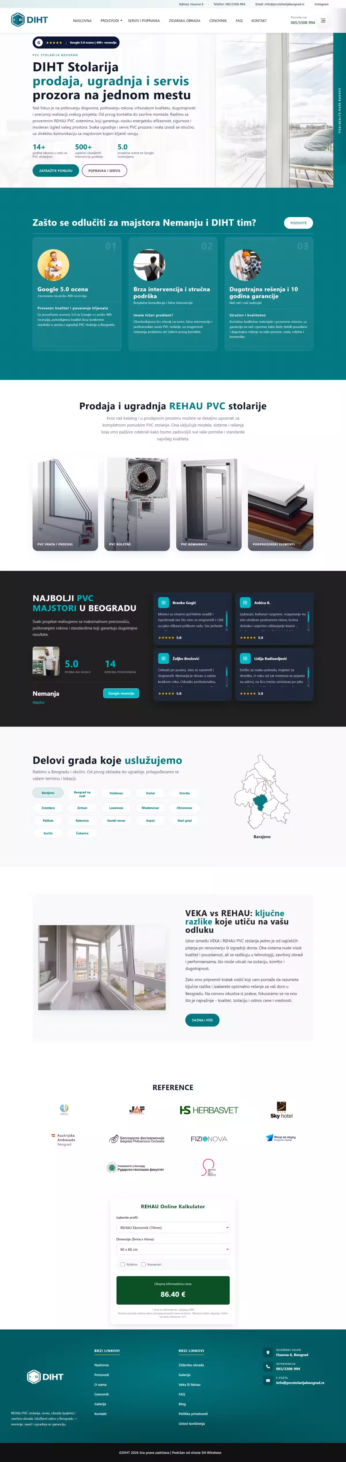
A company with a serious reputation had a Wix site that undermined all of it: poor design, weak UX, no clear path to an inquiry. A visitor who reached the site had neither a reason nor a way to get in touch. The reputation was there, but the site wasn't carrying it or turning it into business.
We ran the redesign from one question: what stands between a visitor and an inquiry. The answer was that the site made them guess which service they needed and where to click. So every service got its own page, and the call to action sits where the decision is made, not only in the footer. Moving from Wix to custom WordPress was a requirement rather than a style choice: without control over the code there is no control over speed or UX.
- Custom WordPress theme, no page builders
- Four service pages: sales, installation, servicing, repairs
- LocalBusiness schema and geo data for Belgrade
- Inquiry form and click-to-call on every page
- A CMS the company uses to update prices, gallery and references
- Live at pvcstolarijabeograd.rs
How it works.
03 stepsFinds the service
Sales, installation, servicing and repairs sit on four separate pages, so visitors land on the one they need.
Checks the company
14+ years, 3,500+ projects and 400+ Google reviews sit exactly where the decision gets made.
Sends an inquiry
A form and click-to-call on every page. No hunting for contact details.
A clean, neutral sans with no ornament. The goal is that prices, measurements and information stay clear and easy to read. For a trade business, trust is built through clarity, not styling.
A blue-green turquoise evokes cleanliness, glass and reliability. It carries the brand and sets the company apart from the typical gray-and-white joinery competition.
A clean white base keeps the focus on products and information, for a tidy, professional impression.
A soft dark gray for body text: readable yet less harsh than pure black.