Apartmani Mikić
Apartmani Mikić offers four well-appointed apartments at Palić, close to the lake. We built a multilingual website (SR/EN/DE/HU) that showcases the accommodation and leads guests to a direct booking, with no platform commission. Delivered as a whitelabel build for a partner agency.
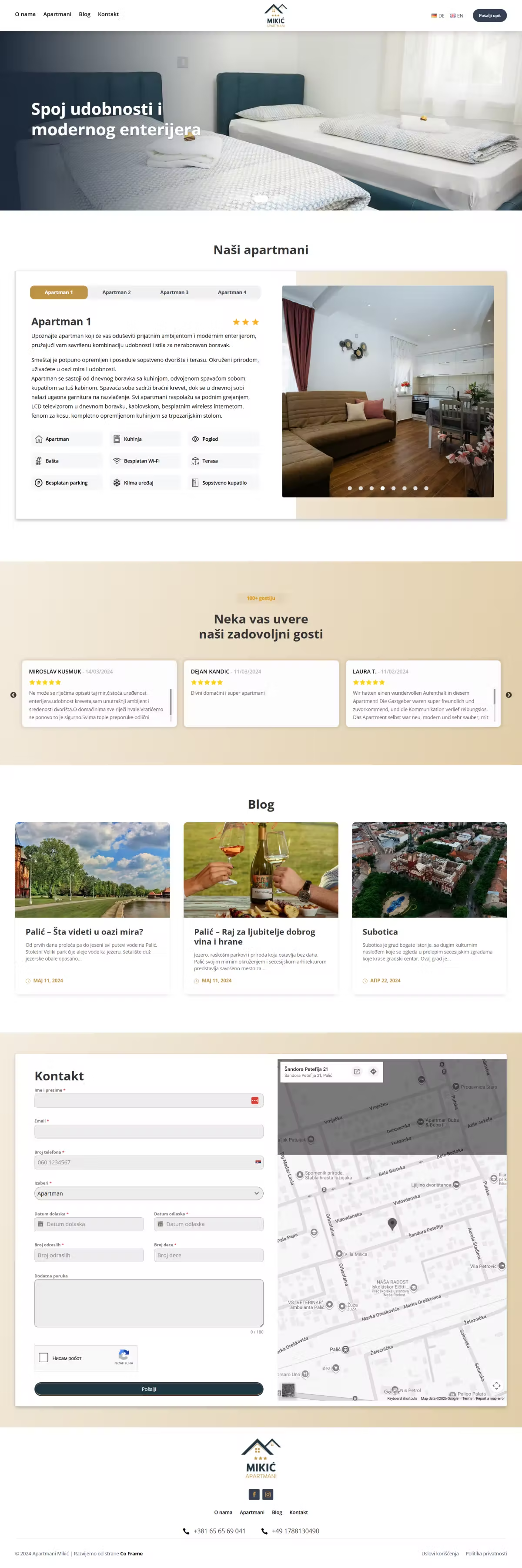
Guests come from several markets: domestic, but also from Germany, Hungary and beyond. Most of them end up on platforms that take a commission. The challenge was to build a site that presents the apartments equally well in four languages, clearly showcases four units with their amenities, and gives guests a reason and a way to book directly.
A guest arriving from the German or Hungarian market isn't looking for a translation, they're looking for a site that reads from the first second as if it were written for them. So language here isn't an add-on, it is the basis of the structure. The second decision was to let photography carry the page: accommodation is chosen with the eyes, and the text only confirms what the picture already promised, “a blend of comfort and modern interiors”.
- The entire site in four languages: SR, EN, DE, HU
- Four apartments with photography, amenities and a per-unit rating
- A booking inquiry and direct contact on every page
- A local SEO foundation for Palić and Subotica
- Built as a whitelabel for a partner agency
- Live at apartmanimikic.com
How it works.
03 stepsPicks an apartment
The units are laid out so the differences show at once: “a holiday for all the senses”, with no fine print to read.
Reads it in their own language
Every guest gets the whole content in their own language, not just the homepage.
Books directly
The inquiry goes to the owner, with no intermediary and no commission added on top.
A warm, friendly and highly readable sans across all four languages (SR/EN/DE/HU): a welcoming impression without pretension, exactly how holiday accommodation should feel.
A warm gold carries the feeling of comfort and a touch of luxury. It invites you to rest and marks the accommodation as special.
A bright blue evokes Lake Palić and the sky: a fresh, summery note alongside the warmth of the gold.
A deep dark navy for text and contrast: an elegant base that makes the gold stand out.
A clean base that lets the apartment photography and nature come through.