Algorithmic Architecture
Algorithmic Architecture is a computational design and automation studio for the AEC industry: parametric and generative design, AI, and design-to-fabrication workflows. We built a bilingual website (EN/SR) that presents serious technical subject matter clearly to architects and engineers who want to work faster.
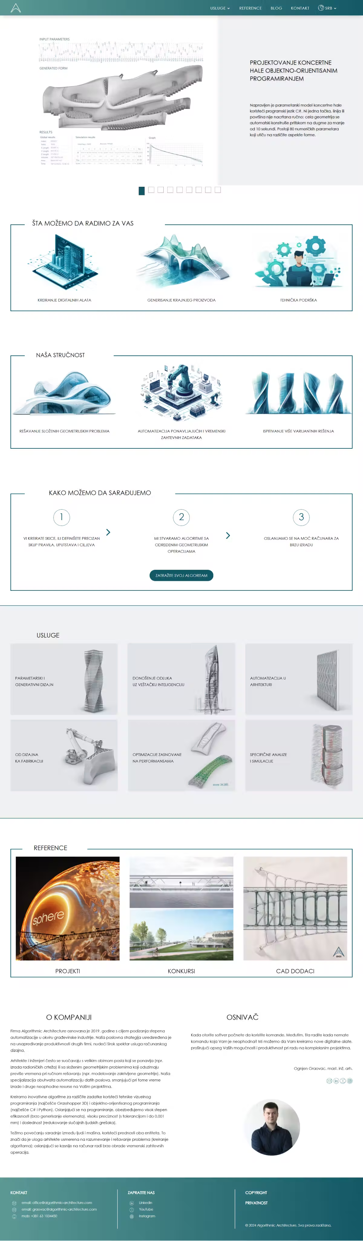
The studio sells something abstract and highly technical: algorithms, parametric design, automation through Grasshopper, C# and Python. The audience is architects and engineers who know the field, but the message had to be clear and convincing both to them and to companies that simply want the result: fewer working hours, higher precision. The challenge was presenting complex services without the site feeling chaotic or overly academic.
The audience knows the field, so explaining the basics only spends their time. But the decision to engage is rarely made by the person writing the script; it is made by someone who needs fewer hours and fewer errors. So the same content sits on two levels: the concrete claim up front, the technical detail directly below. The visual direction follows the same logic, calm and precise, because a studio selling accuracy cannot look improvised.
- Service pages: parametric and generative design, AI, automation, design-to-fabrication
- Optimisation and simulations as separate sections
- Collaboration models written out in advance
- The entire site in English and Serbian
- Built as a whitelabel for a partner agency
- Live at algorithmic-architecture.com
How it works.
03 stepsRecognises their own problem
Services are grouped by what an architect is trying to solve, rather than by what the tool is called.
Sees the numbers
The studio's claims are stated as figures: tolerance down to 0.01mm, geometry in under 10 seconds.
Knows how the work runs
Collaboration models are set out in advance, so the first call is about the project rather than the terms.
Century Gothic is geometric, clean and precise: perfect typography for a studio working in parametric and generative design. Its perfect circles and straight lines mirror the computational approach, while Open Sans keeps the technical body text approachable.
A deep blue-green teal feels technical and precise, yet warmer than plain tech blue: a serious engineering note without coldness.
A muted, softer teal for depth and variation: sections and details that complement the primary color.
A clean, laboratory-like space that highlights geometry and diagrams: focus on content, not decoration.
Maximum contrast for technical text: precision and readability above all.