Inarireach
Inarireach is a B2B cold outreach agency: they find the leads, the client closes the deals. We built the brand and website to carry that message clearly. Confident, results-driven, no noise.
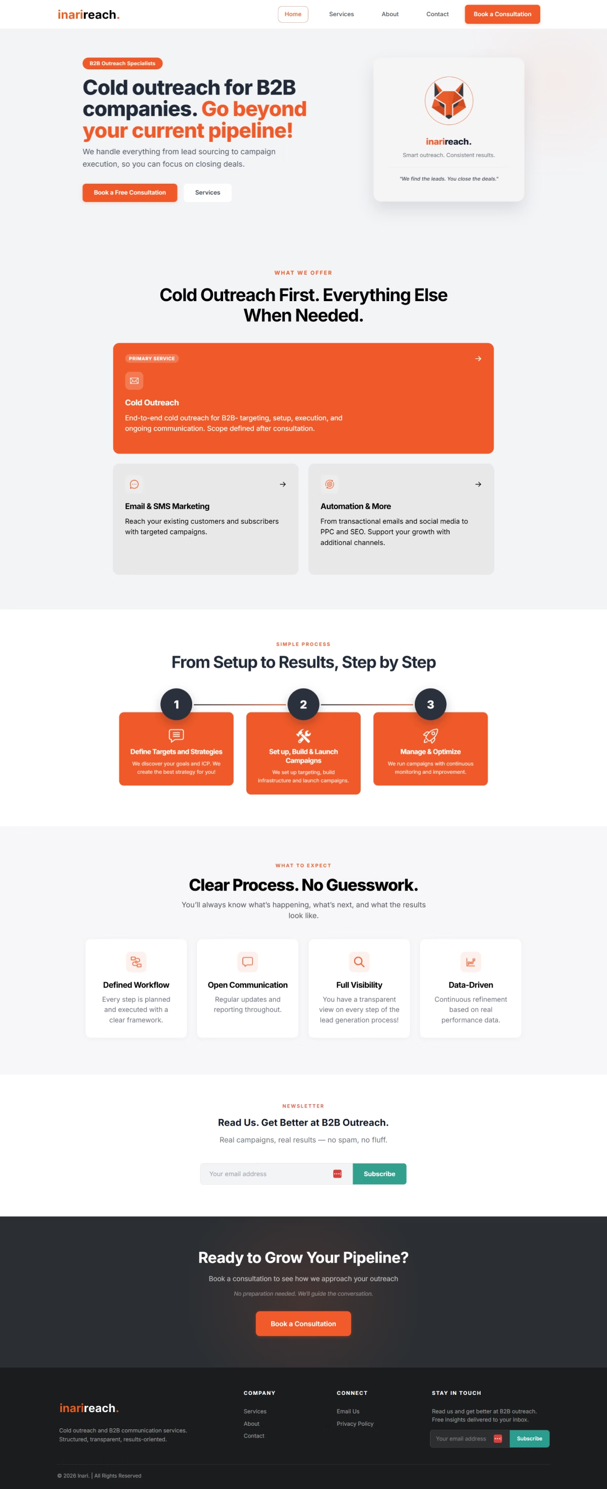
Inarireach sells a service that's hard to show. Outreach happens in other people's inboxes; there's no “product” to display. The website had to earn B2B buyers' trust within seconds, explain the process without jargon, and lead every visitor to one place: a booked consultation.
We started from a single sentence: “We find the leads. You close the deals.” We built a calm, confident visual language around it: generous white space, a clear typographic hierarchy, and the process explained in the buyer's language rather than the agency's. Putting everything on a custom WordPress theme was a business decision rather than a technical one: the team has to edit copy and add services without waiting on us.
- Brand identity: logo, palette and type system
- Service pages built on an SEO structure
- A single call to action across the site: the booked consultation
- Custom WordPress theme, no page builders
- A CMS the team uses to edit copy and add services
- Live at inarireach.com
How it works.
03 stepsDefine the targets
Ideal customer profile, list and outreach strategy before a single email goes out.
Launch the campaigns
Domain and inbox setup, copy and launch: everything ready to scale without spam traps.
Manage and optimise
Reply tracking, A/B tests and continuous, data-driven optimisation.
Inter is a clean, neutral grotesque built for screens. It feels precise and dependable, exactly how a B2B outreach agency wants to sound. No ornament: the message comes first, not the typography.
The only warm, energetic color on an otherwise black-and-white base. It leads the eye to buttons and CTAs, and brings the sense of motion and initiative that outreach demands.
Carries text and headlines: serious, confident, free of noise. Maximum contrast for readability.
Plenty of white space so the message can breathe. A businesslike, premium impression without clutter.
Secondary text and details. It lowers the tone where black shouldn't dominate.